 Docs
DocsApplication Builder - Button element
The Button element is the primary “Call to Action” (CTA) in your application. Unlike a simple Link element, buttons are designed to trigger complex workflows; such as creating database rows, sending emails, or executing API requests.
This page covers how to trigger actions, navigate pages, or submit forms with interactive buttons.
Overview
The Button element is like a trigger that lets users do something when they click it. It’s a way to make things happen with a simple click, making actions easy and quick for users.
- Function: Triggers Events (actions) when clicked.
- Content: The label can be static text (“Submit”) or dynamic data (“Edit
{{ Item Name }}”). - Styling: Colors, typography, and borders are managed via Theme Overrides.
- Layout: Width (Auto vs. Full) and Alignment are managed in the Style Tab.
Add a button
- Open the Elements panel (click the
+icon). - Select Button.
- Drag and drop the element onto your canvas.
Configuration
Click the button to open the General properties tab.
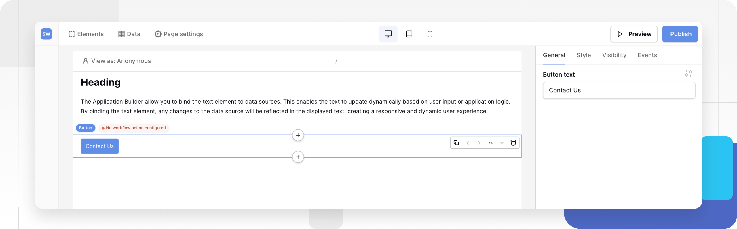
1. Button Text
Enter the label displayed on the button.
- Static: Type a standard label like “Submit”, “Read More”, or “Contact Us”.
- Dynamic: Click the Connect Data icon to bind the text to a Data Source.
- Use Case: “Update
{{ User Name }}” – ensures the user knows exactly which record they are acting upon.
- Use Case: “Update
2. Events (Actions)
The most important part of a button is what it does.
- Click the Events tab in the properties panel.
- Add an On Click trigger.
- Add actions such as:
- Open Page: Navigate to another screen.
- Create/Update Row: Save data to your database.
- Show Notification: Display a success message.
- Send Email: Trigger an SMTP email.
Tip: You can stack multiple actions. For example, Create Row -> Send Email -> Show Notification. Learn more about configuring events.
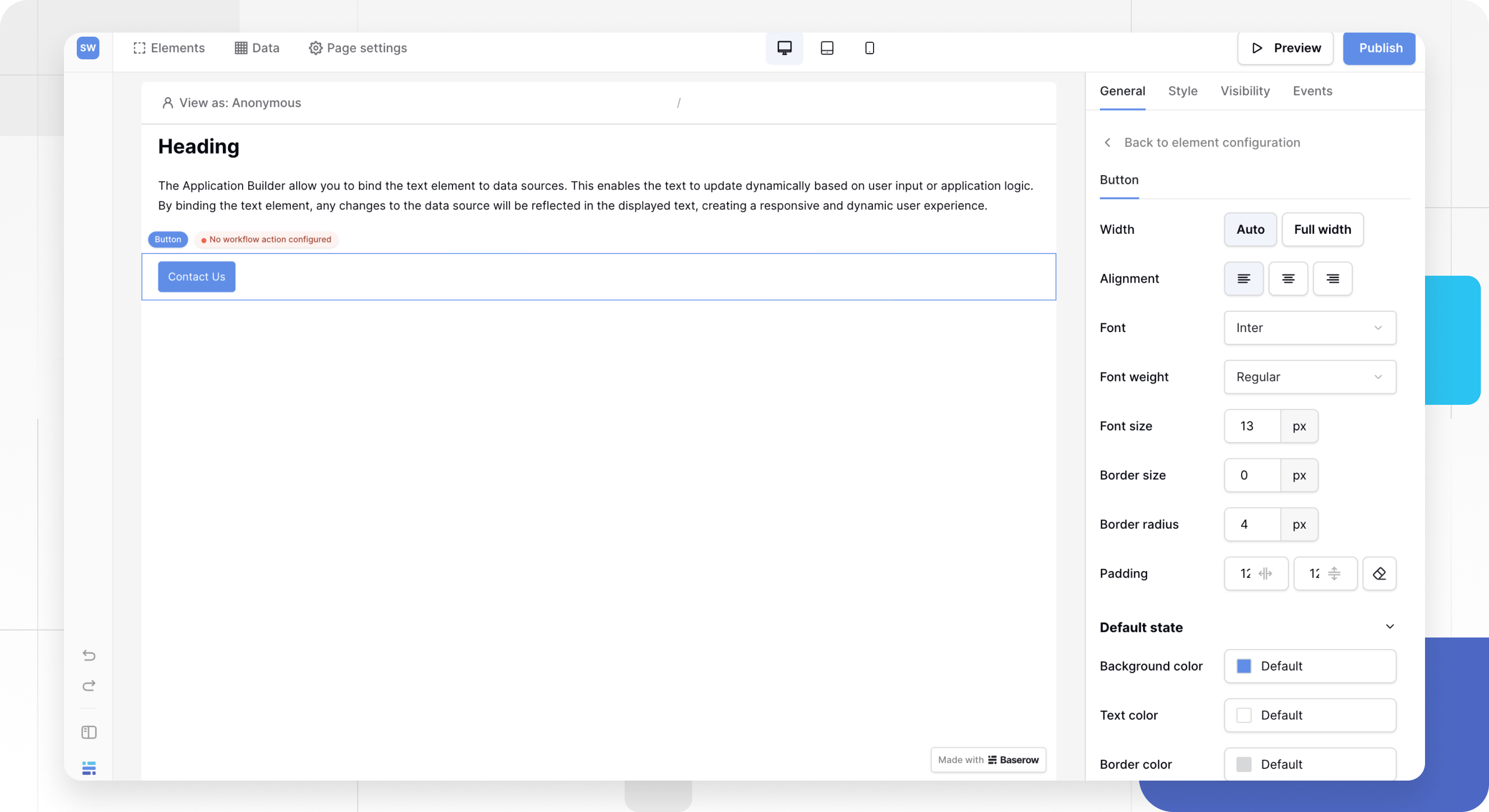
Styling and Theme Overrides
By default, the button inherits the “Primary Button” style defined in your Global Theme. To customize a specific button (e.g., creating a red “Delete” button), use Theme Overrides.
- In the General tab, click the Style/Settings icon (slider icon) next to the Button Text field.
- This opens the Theme Overrides menu where you can configure:
Visual Properties
- Typography: Font family, weight, and size.
- Color: Background color and text color.
- Border: Width, color, and radius (rounding).
- Padding: Internal spacing between the text and the button edge.
Button States
Buttons change appearance based on user interaction. You can style each state independently:
- Default: The normal appearance.
- Hover: When the mouse cursor is over the button.
- Active: The moment the button is clicked.
Layout and alignment
To control how the button sits on the page (width and position), switch to the Style tab at the top of the properties panel.
Width
- Auto: The button width shrinks to fit the text content. Good for standard actions.
- Full Width: The button stretches to fill the entire container. Good for mobile layouts or major calls to action.
Alignment
- Left / Center / Right: Controls where the button sits within its container (if width is set to “Auto”).
Frequently asked questions (FAQ)
Can I put an icon in a button?
Currently, the Button element is text-only. To create an icon button, consider using a standard Image element and checking if it supports “On Click” events, or place a small image next to a text link.
How do I disable a button?
You cannot strictly “disable” a button based on logic (e.g., “disable if form is empty”) in the current version. However, you can use Element Visibility to hide the button entirely if certain conditions (like User Role) are not met.
Why is my button stretching?
Check the Style Tab. If Width is set to “Full Width,” it will expand. Set it to “Auto” and check the Alignment settings to fix it.
Related content
Still need help? If you’re looking for something else, please feel free to make recommendations or ask us questions; we’re ready to assist you.
- Ask the Baserow community
- Contact support for questions about Baserow or help with your account.