 Docs
DocsMenu element
The Menu element is a container for navigation links. Unlike individual Link elements, it groups multiple navigation items together while handling layout, spacing, alignment, and responsive behavior automatically. It’s ideal for building headers, footers, and side navigation.
With the Menu element you can:
- Organize navigation items into a single menu.
- Display items horizontally or vertically.
- Align menu items within the container.
- Configure whether the menu is expanded or collapses into a compact burger menu on desktop, tablet, and mobile devices independently.
Add a menu
- Open the Elements panel (click the
+icon). - Select Menu.
- Drag and drop the element onto your canvas (typically into a Column or Header/Footer container).
Configuration
Click the menu element to open the General properties tab.
1. Menu Items
This is where you define the links, buttons, separators, or spacers.
- Add Item: Click + Add menu item to create a new link.
- Label: Enter the text displayed to the user (e.g., “Home”, “Profile”, “Log Out”).
- Destination: Configure the link target:
- Page: Select an internal application page (and map parameters if needed).
- Custom URL: Enter an external web address.
- Variant: Choose if this specific item should look like a Link (text) or a Button (boxed).
Tip: You can drag and drop items in the list to reorder them.
2. Orientation
Define the layout flow of the menu.
- Horizontal: Items are placed side-by-side. Best for top navigation bars.
- Vertical: Items are stacked on top of each other. Best for sidebars or mobile drawers.
3. Alignment
Control how the items sit within the container.
- Left/Start: Items group to the left.
- Center: Items group in the middle.
- Right/End: Items group to the right.
4. Variant per device type
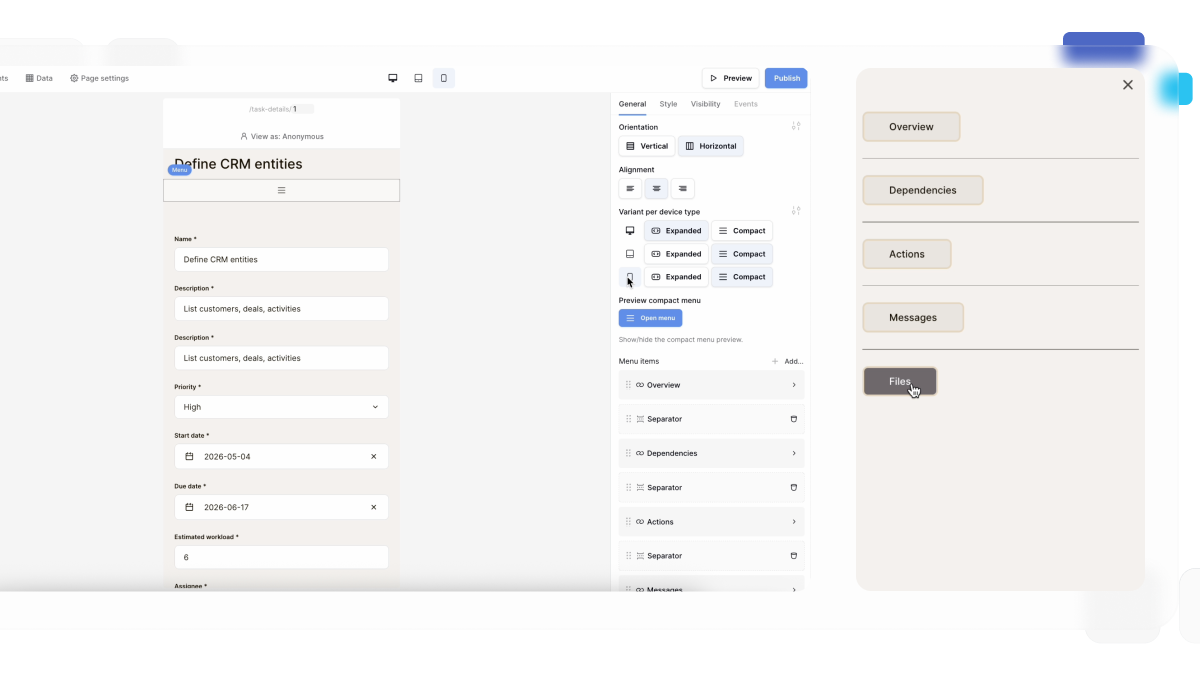
Choose how the menu is displayed on each device independently.
For Desktop, Tablet, and Mobile, you can choose one of two variants:
- Expanded – Displays all menu items.
- Compact – Displays a burger menu that users can open to access the navigation.
This allows you to create responsive navigation without duplicating menu elements or configuring visibility rules.
For example, you can configure:
- Desktop → Expanded
- Tablet → Compact
- Mobile → Compact
Styling and Theme Overrides
To customize fonts, colors, and spacing, use Theme Overrides.
- In the General tab, click the Style/Settings icon (slider icon) next to the configuration fields.
- This opens the Menu Styling modal.
- You will see two specific tabs for customizing the different item variants:
The “Link” Tab
Customize items set to the Link variant.
- Typography: Font, size, and weight for text links.
- States: Define colors for Default, Hover, and Active (current page) states.
The “Button” Tab
Customize items set to the Button variant.
- Background & Border: Define the shape and color of the button box.
- Typography: Style the text inside the button.
- States: distinct styles for Hover and Active states.
Why two tabs? This allows you to mix styles in a single menu. For example, you can have “Home” and “About” look like simple Links, while “Sign Up” looks like a prominent Button.
Frequently asked questions (FAQ)
How do I indicate the current page?
The Menu element automatically detects the active page based on the URL. You can style this “Active State” in the Theme Overrides menu (e.g., making the current link bold or blue) so users know where they are.
Can I create a dropdown menu?
Currently, the Menu element supports a single level of links. To create a dropdown, you may need to use a container with visibility logic or check for updates to the Menu component.
Does the menu collapse on mobile?
The Menu element itself simply lists items. For a responsive mobile experience (like a hamburger menu), you typically place the Menu element inside a container that is hidden on Desktop and visible on Mobile (using Visibility settings).
Related content
Still need help? If you’re looking for something else, please feel free to make recommendations or ask us questions; we’re ready to assist you.
- Ask the Baserow community
- Contact support for questions about Baserow or help with your account.