 Docs
DocsColumns element
The Columns element is a structural container that allows you to break the default vertical stacking of the page. You can split a row into up to 6 columns, controlling the spacing and alignment of the content inside.
This page covers how to create multi-column layouts to organize elements side-by-side.
Overview
A column container serves as a foundational element in organizing your application. It allows you to arrange content for an intuitive user experience. With column containers, you gain the flexibility to structure and customize your layout.
- Layout: Arrange content using up to 6 columns with preset or custom widths.
- Responsive: Choose whether columns stay side by side or stack on desktop, tablet, and mobile devices.
- Container: Drag other elements into each column.
- Alignment: Control the vertical alignment of content within columns.

Add columns
- Open the Elements panel (click the
+icon). - Select Columns.
- Drag and drop the element onto your canvas.
- You will see empty slots (dashed boxes) appear on the canvas.
Add content to columns
Once the structure is in place, you must populate it.
- Add a new element (or select an existing one).
- Drag it into one of the empty column slots.
- You can stack multiple elements inside a single column slot (e.g., a Heading above a Text block within the left column).
Configuration
Click the Columns element to open the General properties tab. Click the Columns element to open the General tab.
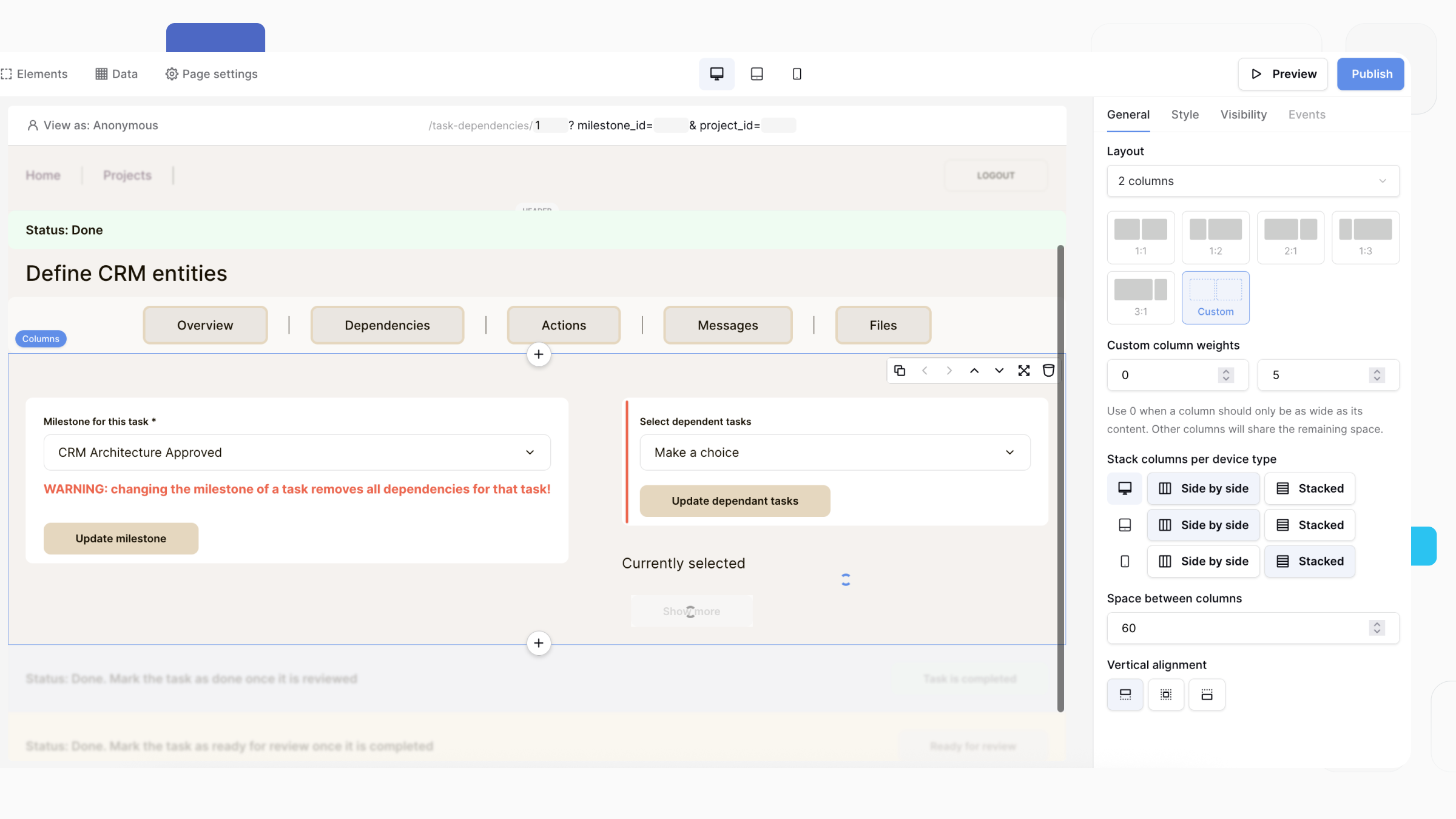
Layout
Choose how your columns are arranged.
You can:
- Select from several preset layouts, such as 1:1:1, 1:1:2, 2:1:1, and 1:2:1.
- Choose Custom to define your own column widths.
- Create up to three columns in a single Columns element.
When using a Custom layout, assign a weight to each column. A value of 0 sizes the column to fit its content, while the remaining columns share the available space according to their weights.
For example:
- 0 : 5 : 5 creates a narrow column sized to its content alongside two equally sized columns.
- 2 : 1 : 1 makes the first column twice as wide as the other two.
This allows you to build layouts such as a logo, navigation menu, and login button while controlling how much space each section occupies.
Stack columns per device type
Choose how columns are displayed on different screen sizes.
For each device type, you can choose:
- Side by side — Columns remain next to each other.
- Stacked — Columns are displayed vertically.
You can configure this independently for:
- Desktop
- Tablet
- Mobile
This makes it easy to create responsive layouts that adapt to different devices without creating separate pages.
Space between columns
Set the horizontal spacing between columns.
Increase this value to create more whitespace between columns or reduce it to place content closer together.
Vertical alignment
Control how content is aligned within each column when columns have different heights.
Available options are:
- Top — Align content to the top of the column.
- Center — Center content vertically.
- Bottom — Align content to the bottom of the column.
This is useful when placing smaller elements, such as buttons, next to taller content like forms or text blocks.
Example
Create a three-column layout for a page header:
- Column 1: Company logo (content-sized)
- Column 2: Navigation menu
- Column 3: Login button
Configure the layout as 0 : 5 : 5 so the logo only takes the space it needs while the navigation and login sections share the remaining width. Set Desktop to Side by side and Mobile to Stacked so the layout automatically adapts to smaller screens.
Frequently asked questions (FAQ)
What happens on mobile devices?
To ensure your application is mobile-friendly, Baserow automatically “stacks” the columns. On a phone screen, Column 1 will appear at the top, followed by Column 2 beneath it, and so on.
Can I change the background color of a column?
The Columns element itself is purely structural and does not have visual styling properties like backgrounds or borders. To add a background, you should style the specific elements inside the column (e.g., add a Container or styled Group if available, or style the individual text/image elements).
Can I nest columns?
Currently, you cannot place a Columns element inside another Columns element. To achieve complex grids, try using a Table or Repeat element depending on your data needs.
Related content
Still need help? If you’re looking for something else, please feel free to make recommendations or ask us questions; we’re ready to assist you.
- Ask the Baserow community
- Contact support for questions about Baserow or help with your account.