 Docs
DocsGallery view
Gallery view transforms your data into visual cards with cover images and customizable field layouts, making it ideal for portfolios, product catalogs, and any data where visuals matter.
This guide shows how to use Baserow’s Gallery view to display data as visual cards, perfect for browsing images, documents, and content-rich records.
What is Gallery view?
Gallery view displays your data as visual cards instead of spreadsheet rows. Each record becomes a card that can feature a cover image, making the Gallery view perfect for browsing content where visual presentation matters more than detailed data manipulation.
Gallery view excels at: Product catalogs with images, team directories with photos, portfolio management, document libraries, real estate listings, recipe collections, and any scenario where visual browsing improves the user experience.
Learn more about views in general: Views overview
Gallery view vs other view types
| Feature | Gallery | Grid | Kanban | Calendar |
|---|---|---|---|---|
| Best for | Visual browsing | Detailed data work | Status tracking | Date-based events |
| Data density | Medium | High | Low | Medium |
| Cover images | ✓ Prominent | – | – | – |
| Card customization | ✓ | – | ✓ Limited | – |
| Manual card ordering | ✓ | ✓ Rows only | – | – |
| Multi-line text display | ✓ Comfortable | Limited | Limited | Limited |
| Visual identification | ✓ Excellent | Poor | Good | Good |
Learn more: Grid view | Kanban view | Calendar view
Create a Gallery view
- Click the view dropdown at the top-left of the table
- Select Gallery from the view type options
- Choose Collaborative or Personal permission type
- Enter a name for the Gallery view
- Click Create view

The new Gallery view displays all table records as cards. If your table has file fields, you can configure one as the cover image. Customize which fields appear on cards using the “Customize cards” button.
Configure cover images
The cover field determines which image appears prominently on each card. This is the defining feature of Gallery view; making visual content the focal point of each record.
Requirements for cover fields
Your table must contain at least one file field to use cover images. File fields can contain images, PDFs, documents, or any uploaded files. When a file field contains an image, it displays as a visual thumbnail. Other file types show as file icons.
Set or change the cover field
- Click Customize cards in the Gallery view toolbar
- Find the Cover field dropdown at the top
- Select which file field to use as the cover
- Choose No cover if you don’t want cover images

Multiple file fields: If your table has multiple file fields (e.g., “Product Photo” and “Technical Drawing”), you can choose which one appears as the card cover. Create different Gallery views with different cover fields to emphasize different visuals.
No file fields: Gallery view still works without file fields. Cards display without cover images, showing only the configured fields. This is useful for text-heavy content where images aren’t available or necessary.
Cover images are visible when you share the Gallery views publicly, making them perfect for external portfolios or catalogs.
Customize card content
Control exactly which fields appear on gallery cards and in what order. This customization is unique to each Gallery view; different views can display different fields.
Hide or show fields on cards
- Click Customize cards in the Gallery view toolbar
- Toggle fields on/off to show or hide them on cards
- Use Hide all to hide everything except the cover
- Use Show all to display all available fields
- Use the search box to quickly find specific fields
Green toggles (switched right) indicate visible fields. Gray toggles (switched left) indicate hidden fields.
Hidden fields strategy: Hide fields that aren’t useful for visual browsing. For example, in a product catalog gallery, hide internal fields like “Supplier ID” or “Last Updated” while showing customer-facing fields like “Price” and “Description.”

Reorder fields on cards
Field order on cards affects readability and emphasis. Put most important fields first.
- Click Customize cards in the Gallery view toolbar
- Click and drag the drag handle (⋮⋮) next to any field name
- Move the field up or down to its desired position
- Release to set the new order

Field order saves per view. Create multiple Gallery views with different field arrangements optimized for different audiences or purposes.
Gallery view toolbar options
The toolbar at the top of Gallery view provides quick access to common operations:
Filter - Show only cards matching specific conditions. Useful for creating filtered catalogs or specialized collections.
Sort - Order cards automatically by field values. Sort by price, date, name, or any field.
Share view - Generate public links or embed codes to share your gallery externally. Perfect for portfolios or product showcases.
Row colors - Apply conditional formatting to highlight specific cards based on field values.
Customize cards - Configure cover images and control which fields appear on cards (covered above).
Manual card ordering
When no automatic sorts are applied, you can manually arrange cards by dragging them.
- Ensure no sort conditions are active (remove them if present)
- Click and drag any card to a new position
- Drop the card in its new location
- The manual order persists until you apply automatic sorting

Manual reordering is disabled when sort conditions are active. Remove all sorts first to enable drag-and-drop reordering.

Manual ordering is perfect for featured product lists, prioritized portfolios, or any scenario where your judgment matters more than field-based sorting.
Gallery view management
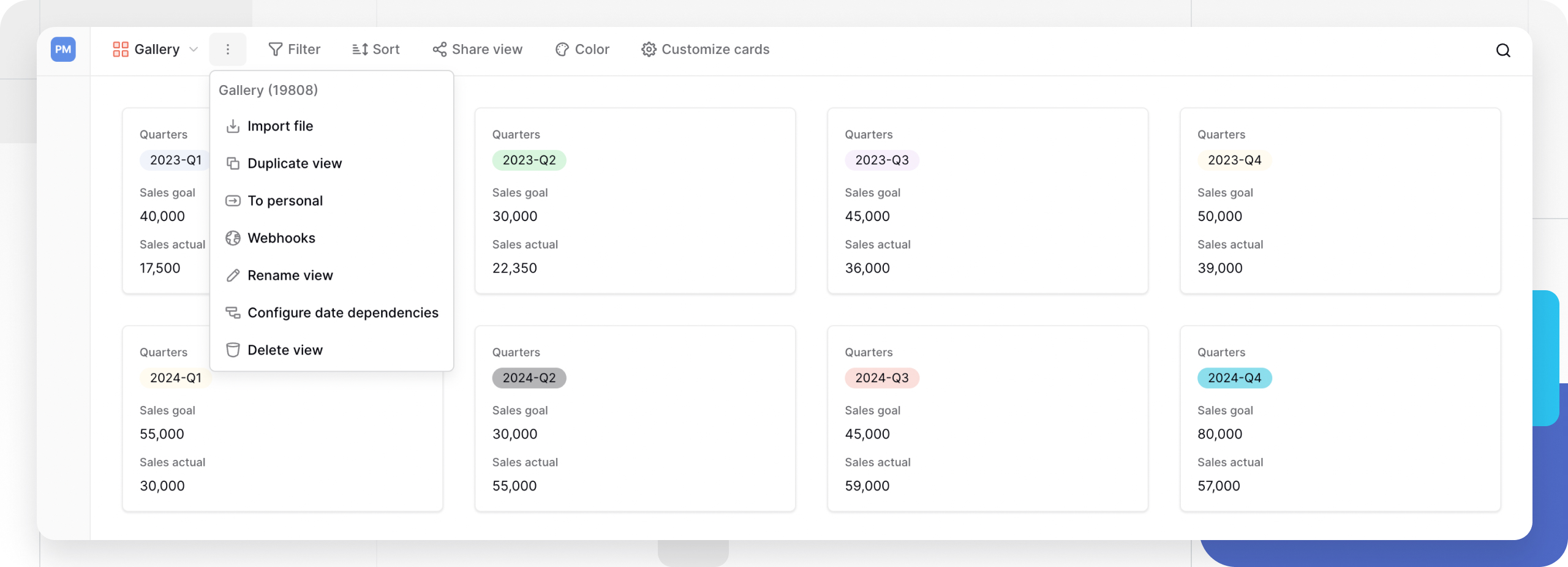
Access view management options by clicking the three-dot menu (⋮) next to the view name:
- Duplicate view - Copy configuration to a new view
- Import file - Add data from CSV, JSON, or XML files
- Convert view type - Change between collaborative and personal
- Webhooks - Configure external notifications
- Rename view - Update the view name
- Delete view - Remove the view permanently
Learn more: View configuration options
Why use Gallery view?
Gallery view prioritizes visual presentation over data density. Unlike Grid view’s spreadsheet interface, Gallery view makes images and visual content the focal point.
Visual-first browsing: Cover images appear prominently on each card, making it easy to identify records at a glance. This is invaluable when working with product photos, profile pictures, document thumbnails, or any content where images convey key information.
Card-based layout: Each record displays as an independent card with customizable field order. Cards show multiple lines of text comfortably, making Gallery view better than Grid view for content with long descriptions or notes.
Customizable card content: Control which fields appear on cards and in what order. Hide irrelevant fields to keep cards clean and focused. Different Gallery views of the same table can show different fields on their cards.
Manual or automatic ordering: Drag cards to rearrange them manually, or apply automatic sorts by any field. Manual reordering is particularly useful for prioritizing featured items or organizing content by preference.
Frequently asked questions
Can I use Gallery view without images?
Yes. Gallery view works perfectly without cover images; cards simply display your configured fields without a visual header. This is useful for text-heavy content like blog posts, notes, or articles where images aren’t available or necessary.
What happens if a file field is empty?
Cards without cover images display a placeholder or show only the configured fields. This doesn’t break the Gallery view; it just means that particular card lacks visual content. Consider using a default image or marking records that need images.
Can I have different cover images in different Gallery views?
Yes. If your table has multiple file fields, each Gallery view can use a different one as its cover field. For example, create “Product Photos” gallery with the main product image and “Technical Drawings” gallery with engineering diagrams; both views showing the same records with different covers.
Why can’t I drag cards to reorder them?
Manual card reordering is disabled when automatic sort conditions are active. Click the Sort button in the toolbar and remove all sort conditions. Once sorts are cleared, you can drag cards freely. The sort and manual ordering are mutually exclusive.
How many fields should I show on gallery cards?
This depends on your use case, but generally 3-6 fields keep cards readable. Too many fields make cards cluttered and hard to scan. Hide internal or administrative fields and show only what users need for browsing. You can always expand cards to see all fields.
Can I export Gallery view data?
Gallery view doesn’t have a direct export option. Switch to Grid view to access export functionality, or use table export to download all data. The export will contain the same data; only the export access point differs.
Does Gallery view work with linked records?
Yes. Gallery view displays up to 20 linked items by default. If you need to access more linked records, use the search functionality in the row select modal or adjust the linked table’s view filters to show only relevant items.
Related resources
View basics
- Views overview - Understanding all view types
- Create custom views - Step-by-step view creation
- View configuration options - Filters, sorts, and settings
Gallery view features
- File field - Upload images and documents for cover fields
- Filters in Baserow - Show specific cards
- Row coloring - Highlight important cards
- Public sharing - Share galleries externally
Card customization
- Field customization - Control field visibility
- Row configuration - Expand cards for details
Other view types
- Grid view - Spreadsheet interface
- Kanban view - Project boards with cards
- Calendar view - Date-based scheduling
- Form view - Data collection
Still need help? If you’re looking for something else, please feel free to make recommendations or ask us questions; we’re ready to assist you.
-
Contact support for questions about Baserow or help with your account