 Docs
DocsApplication Builder - Image element
The Image element allows you to embed visuals in your application. You can upload a fixed file (like a logo) or bind the source to a URL from your database (like a product photo that changes for each row).
This guide covers how to display static assets or dynamic images linked to your database records.
Overview
- Source Options: You can Upload a file directly or use a URL (link).
- Dynamic Binding: By using the URL option, you can connect the image to a Data Source to display different images for different database records.
- Accessibility: You can define Alt Text for screen readers and SEO.
- Styling: Visual properties like Size, Alignment, Aspect Ratio (Constraints), and Border Radius are managed via Theme Overrides.
Add an image
- Open the Elements panel (click the
+icon). - Select Image.
- Drag and drop the element onto your canvas.
Configuration
Click the image element to open the General properties tab. You will configure the content here.
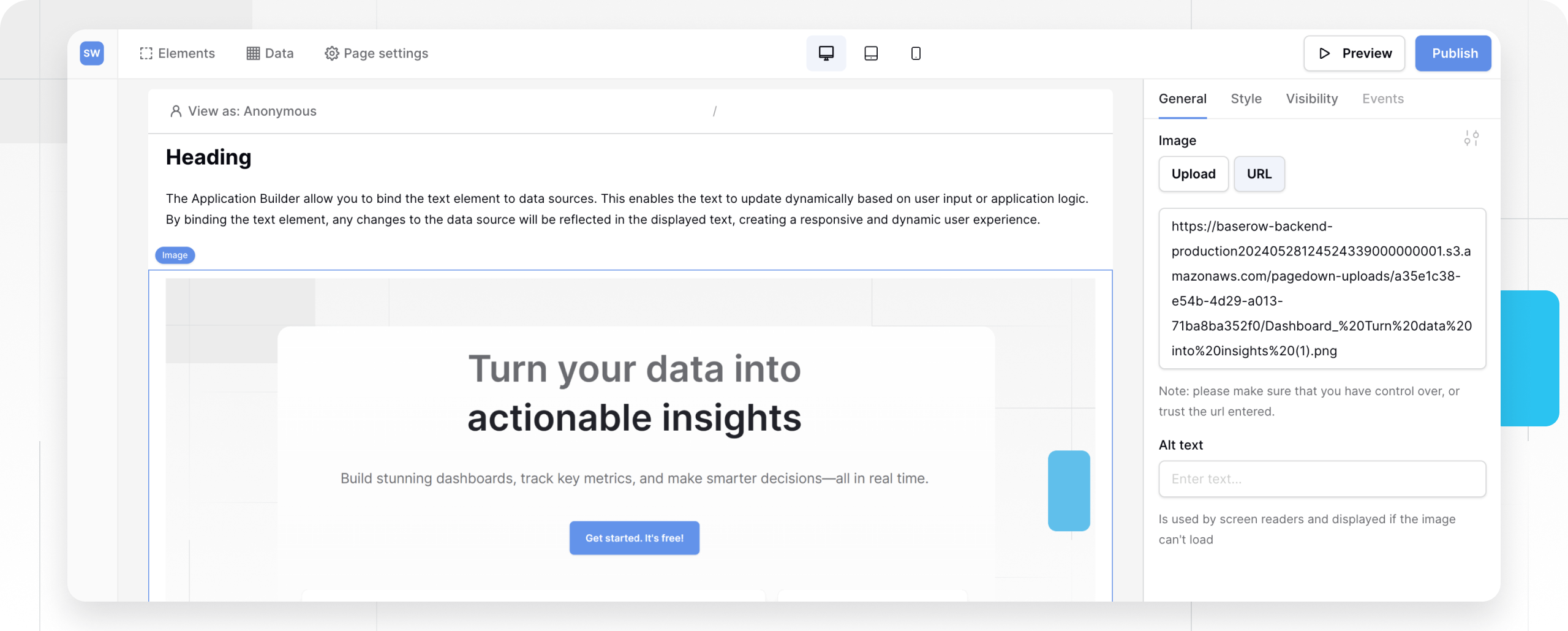
1. Image Source
Choose how Baserow finds the image.
- Upload: Click the Upload button to select a file from your computer. Use this for static assets like banners, logos, or icons that never change.
- URL: Select this to link to an image hosted online.
- Static URL: Paste a direct link (e.g.,
https://example.com/logo.png). - Dynamic URL: Click the Connect Data icon to bind this field to a Data Source.
- Use Case: If you have a table of employees with a “Headshot URL” field, bind this property to that field to show the correct face for each employee profile.
- Static URL: Paste a direct link (e.g.,
2. Alt Text
Enter a short description of the image. This is displayed if the image fails to load and is read aloud by screen readers.
- Best Practice: Describe the content (e.g., “Red running shoe”) rather than the function (e.g., “Image”).
- Dynamic: You can also bind this to a data source (e.g.,
{{ Product_Name }}) to automatically generate relevant alt text for every record.
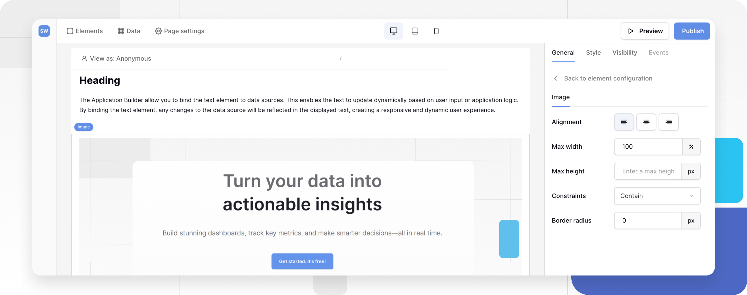
Styling and Theme Overrides
To customize the dimensions, alignment, and fit of the image, you must use a Theme Override.
- In the General tab, click the Style/Settings icon (slider icon) next to the configuration fields.
- This opens the Image Styling menu where you can configure:
Dimensions (Size)
Control the physical size of the image container.
- Max Width (%): Sets the width relative to the parent container (0-100%).
- Max Height (px): Sets a fixed maximum height in pixels (5-3000px).
Constraints (Object Fit)
Determines how the image scales to fit inside the dimensions you set above.
| Constraint | Behavior | Best For |
|---|---|---|
| Extend to max width | Stretches the image to fill the available width while maintaining aspect ratio. | Hero images, full-width banners. |
| Contain | Scales the image so it fits entirely within the container without cropping. | Product photos, logos where seeing the whole image matters. |
| Cover | Fills the entire container, potentially cropping the edges of the image to fill the space. | Backgrounds, avatars, grid thumbnails. |
Note: Some constraints depend on dimensions. For example, Cover requires a specific height to work effectively, while Contain is unavailable if height is limited.
Appearance
- Alignment: Position the image to the Left, Center, or Right of its container.
- Border Radius: Round the corners of the image. Set to a high number (e.g., 50% or 100px) to create circular avatar images.
Frequently asked questions (FAQ)
Which image formats are supported?
You can display standard web formats including JPEG, PNG, GIF, WEBP, and SVG.
Why is my image distorted?
If you force both a specific Width AND a specific Height that doesn’t match the original aspect ratio, the image may skew. Use the Constraints setting (Cover or Contain) to handle aspect ratios gracefully.
Can I link an image to a page?
The Image element itself is purely for display. To make an image clickable, you should wrap it in a Link container or use a Card element (if available), or check if the Events tab allows an “On Click” -> “Open Page” action for the image.
Related content
Still need help? If you’re looking for something else, please feel free to make recommendations or ask us questions; we’re ready to assist you.
- Ask the Baserow community
- Contact support for questions about Baserow or help with your account.