 Docs
DocsApplication Builder - Repeat element
The Repeat element (often called a “Repeater” or “Collection”) is a container that iterates through a list of data. You design the layout for a single item (the template), and the element automatically repeats that layout for every row in your Data Source.
This page covers how to display dynamic lists, grids, or nested collections from your database.
Overview
Repeat elements allow you to display lists or collections of data. Instead of manually creating multiple instances of similar elements, repeat elements can dynamically generate as many instances as needed based on the data source.
- Dynamic Content: Connects to a “List multiple rows” Data Source to display records.
- Layouts: Supports Vertical lists (rows) or Horizontal grids (cards).
- Nesting: You can place a Repeat element inside another Repeat element to show related data (e.g., “Employees” inside “Departments”).
- Styling: Layout spacing is configured in the General tab, while button styles (Show More, Filters) are managed via Theme Overrides.
Add a repeat element
- Open the Elements panel (click the
+icon). - Select Repeat.
- Drag and drop the element onto your canvas.
- Important: You must now drag other elements (like Headings or Text) inside the Repeat box to define what each item looks like.
Configuration
Click the element to open the General properties tab.
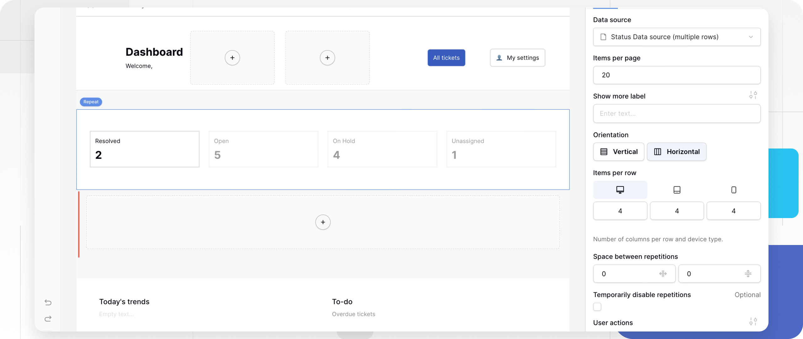
1. Data Source
Select where the list comes from.
- Root-level collection: Select a Data Source (service type: List multiple rows).
- Nested collection: If placed inside another Repeat element, you can select a Link to Table field to show related records.
2. Layout & Orientation
Control how the items are arranged.
- Orientation:
- Vertical: Stacks items on top of each other (standard list).
- Horizontal: Places items side-by-side (grid/cards).
- Items per row: (Horizontal only) Define how many items appear per row on Desktop, Tablet, and Mobile.
- Space between repetitions: Define the gap (in pixels) between each item in the list.
3. Pagination
Control how much data loads at once.
- Items per page: Set the limit (max 100) for the initial load.
- Show more label: Customize the text of the button that loads the next batch (e.g., “Load more products”).
4. User Actions (Filters & Search)
Allow public users to interact with the list.
- Filter / Sort / Search: Check the boxes to enable these features.
- Fields: Select which specific columns (e.g., “Name”, “Price”) the user is allowed to filter or search by.

5. Developer Tools
- Temporarily disable repetitions: Check this box to hide all items except the first one. This is useful during design time so you can focus on editing the template without seeing 50 copies of it on your canvas.
Styling and Theme Overrides
While the Repeater layout is structural, it generates interactive buttons (the “Show More” button and “User Action” buttons). You can style these using Theme Overrides.
- In the General tab, look for the Style/Settings icon (slider icon) next to Show more label or User actions.
- Clicking this opens the specific styling menu for those buttons.
Styling the “Show More” Button
- Typography: Font family, weight, size.
- Colors & States: Define the Background and Text color for Default, Hover, and Active states.
- Spacing: Adjust padding to control button size.
Styling User Action Buttons
- Button Style: Customize the “Filter” and “Sort” buttons that appear above the list.
- States: Set distinct colors for when a filter is active vs. inactive.
Advanced: Hierarchy and Nesting
The Repeat element is powerful because it supports nesting.
- Example: A “Department” directory.
- Structure:
- Outer Repeater: Connected to “Departments” data source. Contains a Heading (
{{ Department Name }}). - Inner Repeater: Placed inside the outer one. Connected to the “Employees” link field. Contains a Text element (
{{ Employee Name }}).
- Outer Repeater: Connected to “Departments” data source. Contains a Heading (
- Result: The app displays a list of departments, and under each department, a list of its specific employees.

Frequently asked questions (FAQ)
Why is my Repeat element empty?
Ensure you have selected a valid Data Source and that the data source actually returns rows. Also, check that you have placed elements (like Text or Images) inside the Repeat container and mapped them to fields.
Can I limit the number of items?
Yes. Use the Items per page setting. If you want a hard limit (e.g., “Top 3 items”) without a “Show More” button, you might need to configure the limit on the Data Source filters instead.
How do I make a grid layout?
Set Orientation to “Horizontal” and set Items per row to 3 (or your desired number). This creates a card-style grid.
Related content
Still need help? If you’re looking for something else, please feel free to make recommendations or ask us questions; we’re ready to assist you.
- Ask the Baserow community
- Contact support for questions about Baserow or help with your account.