 Docs
DocsLink element
The Link element is the primary tool for navigation. It can appear as a simple text hyperlink or a call-to-action button. You use it to connect different parts of your application, drill down into row details, or direct users to external resources.
This guide covers how to create navigation links to internal pages or external websites.
Overview
The Application Builder allows you to bind the text to data sources. This enables the text to update dynamically based on user input or application logic.
- Navigation: Can point to an Internal Page (inside your app) or a Custom URL (external website).
- Dynamic Context: When linking to internal pages, you can pass data (like a Row ID) to load specific content.
- Visual Variants: You can style the element as a standard text Link or a prominent Button.
- Styling: Colors, typography, and interaction states (Hover/Active) are managed via Theme Overrides.
Add a link
- Open the Elements panel (click the
+icon). - Select Link.
- Drag and drop the element onto your canvas.
Configuration
Click the element to open the General properties tab.
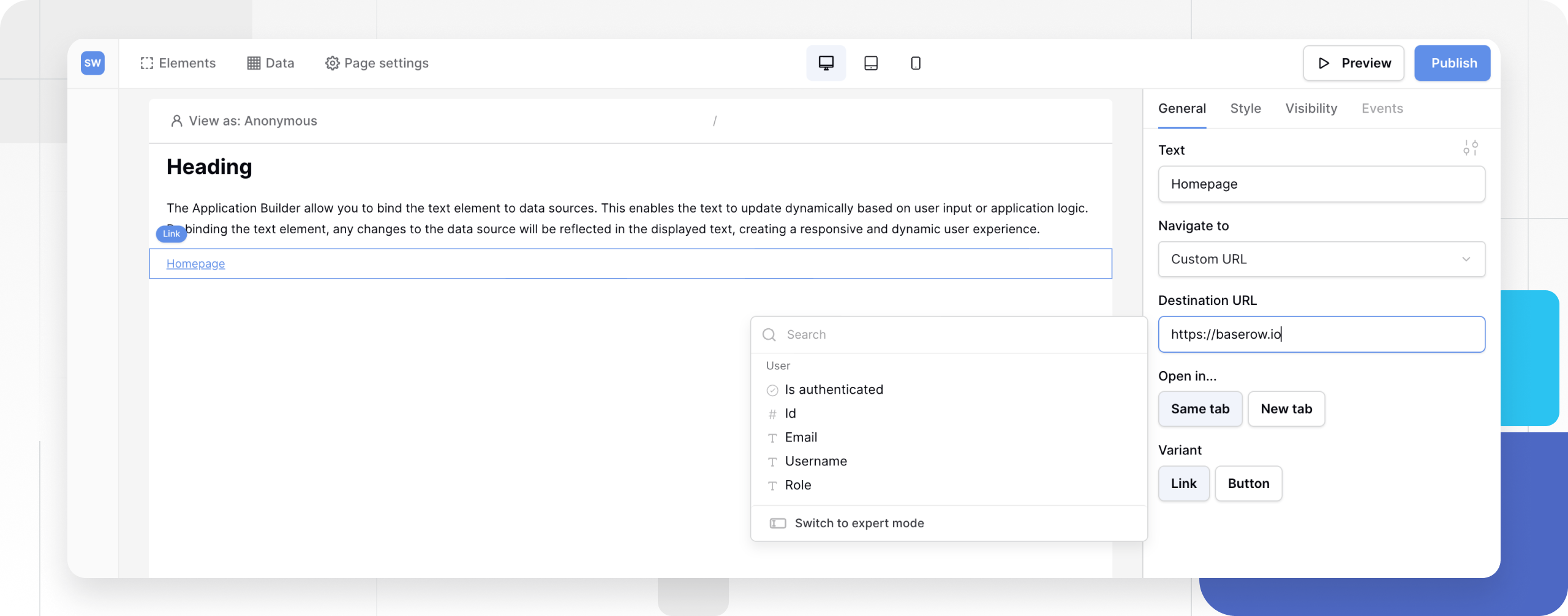
1. Text
Enter the label user will click on.
- Static: Type “Read More” or “View Details”.
- Dynamic: Click the Connect Data icon to bind this to a data source (e.g., displaying
{{ Company Name }}).
2. Navigate to (Destination)
Choose where the user goes when they click.
Option A: Page (Internal)
Select an existing page from your application.
- Parameters: If the destination page has a Path Parameter (e.g.,
/product/:id), a new field will appear asking you to map the value.- Use Case (Row Details): To link to a specific product’s detail page, select the destination page, then map the
:idparameter toCurrent Record > Record ID.
- Use Case (Row Details): To link to a specific product’s detail page, select the destination page, then map the
Option B: Custom URL (External)
Select Custom URL to link outside your app.
- URL: Enter the full address (e.g.,
https://google.comormailto:support@example.com).
3. Open in
Control browser behavior.
- Same tab: Replaces the current page. Best for internal navigation.
- New tab: Opens a new browser window. Best for external links to keep users on your app.
4. Variant
Choose the fundamental look of the element.
- Link: Appears as text (usually underlined or colored). Best for inline navigation or secondary actions.
- Button: Appears as a colored box. Best for primary calls-to-action (CTAs).
Styling and Theme Overrides
By default, the link inherits styles from your Global Theme. To customize a specific link (e.g., changing its color or alignment), use a Theme Override.
- In the General tab, click the Style/Settings icon (slider icon) next to the configuration fields.
- This opens the Styling Menu where you can override:
Typography & Alignment
- Font Family, Size, Weight
- Alignment: (Left, Center, Right). Note: This controls the text alignment within the element container.
- Border size, radius, padding for button variant.
Colors and States
Links and buttons have interactive states. You can define different colors for each state to provide visual feedback:
- Default: How the link looks normally.
- Hover: How it looks when the mouse cursor is over it.
- Active: How it looks at the moment it is clicked.

Note: To change the width of a Button variant (e.g., make it Full Width), switch to the Style Tab (Layout settings) and adjust the Width property.
Frequently asked questions (FAQ)
How do I create a “Back” button?
Add a Link element, select Page as the destination, and choose the previous page in your hierarchy. Currently, there is no automatic “Browser Back” function, so you must define the destination explicitly.
Can I pass data between pages?
Yes. If you need to pass data (like a User ID or Category), ensure the destination page has a Path Parameter set up in its Page Settings. The Link element will then allow you to map data to that parameter.
Why is my button width not changing?
The Variant setting only changes the visual style (Text vs. Box). To change the actual size/width of the container, click the Style tab at the top of the properties panel and change Width to “Full Width” or “Normal”.
Related content
Still need help? If you’re looking for something else, please feel free to make recommendations or ask us questions; we’re ready to assist you.
- Ask the Baserow community
- Contact support for questions about Baserow or help with your account.