 Docs
DocsApplication Builder - Heading element
Headings are static or dynamic text elements used to organize your page. They provide visual hierarchy, allowing users to scan content easily, and are essential for accessibility and SEO.
This guide covers how to display titles and section headers to structure your application content.
Overview
Headings are important for structuring the page and guiding users through content on the page. They establish a hierarchy, making it easier to scan information.
- Function: Displays large, bold text for titles.
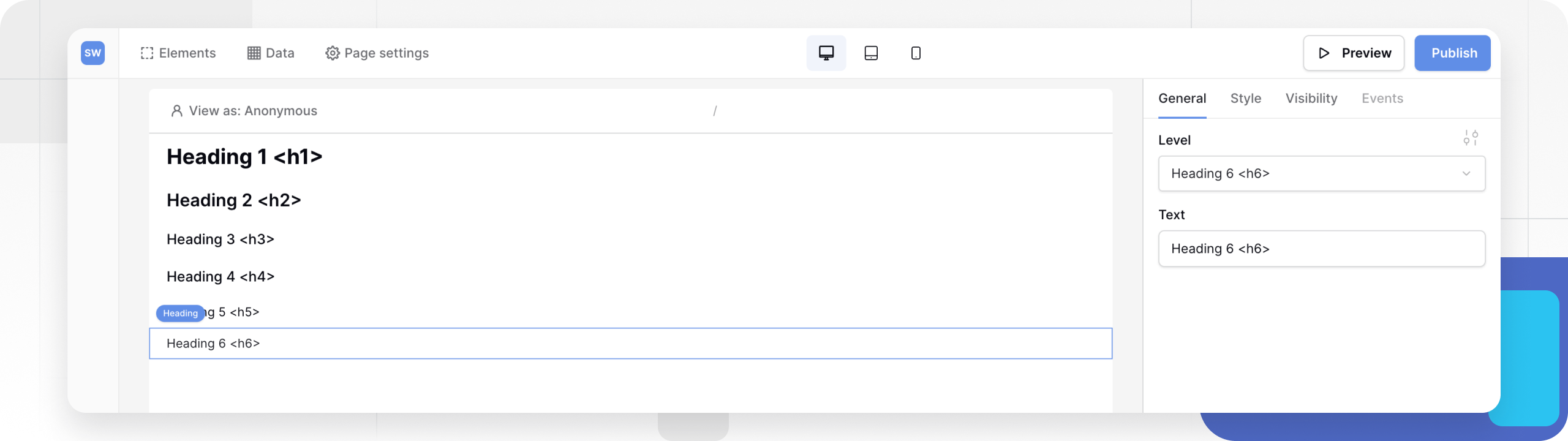
- Levels: Supports tags
H1throughH6for semantic structure. - Dynamic Data: You can bind the text to a Data Source (e.g., to display a record name as a page title).
- Styling: Typography (Font, Color, Alignment) is managed via Theme Overrides, defaulting to your Global Theme settings.
Add a heading
- Open the Elements panel (click the
+icon). - Select Heading.
- Drag and drop the element onto your canvas.
Configuration
Once added, click the heading to open the General properties tab. There are two primary configuration options:
1. Heading Level
Select the semantic tag for the heading. This determines the relative size and importance of the text.
- H1: The most important heading. Use this once per page for the main title.
- H2 - H3: Use these for major section dividers.
- H4 - H6: Use these for sub-sections or minor titles.
2. Text (Content)
Enter the actual text you want to display. You have two options:
- Static Text: Type plain text directly into the field (e.g., “Our Services”).
- Dynamic Data: Click the Plug icon or Connect Data button to bind the text to a Data Source. This allows the heading to change based on the context (e.g., displaying
{{ Product_Name }}on a product detail page).
Styling and Theme Overrides
By default, the heading inherits the font family, color, and weight defined in your Global Theme.
To customize the look of a specific heading (e.g., to make one specific H2 red and centered), you must use a Theme Override.
- In the General tab, look for the Style/Settings icon (slider icon) next to the configuration fields.
- Clicking this opens the Typography menu.
- Here you can override the following properties for this specific element:
- Font Family & Weight
- Size (Pixel or Rem)
- Alignment (Left, Center, Right, Justify)
- Color (Hex, RGB, or Theme variable)
- Text Decoration (Underline, Strikethrough)
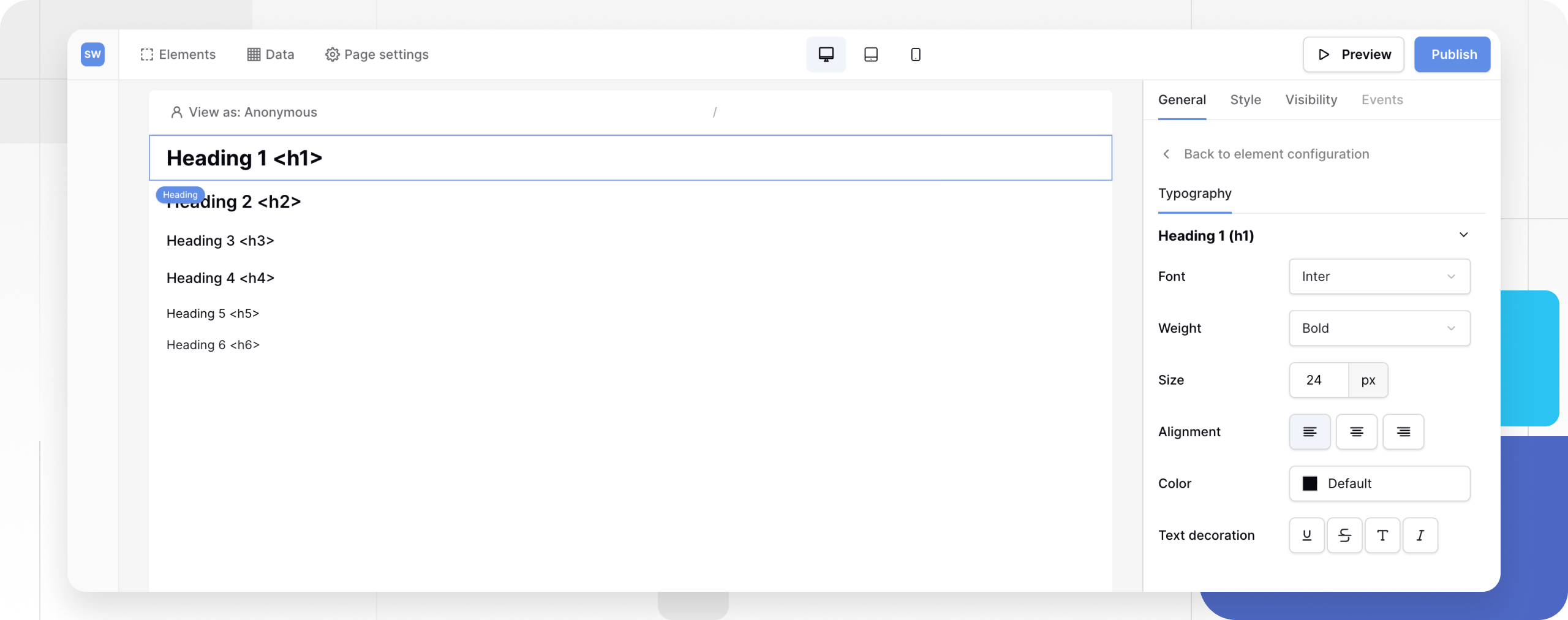
Note: Changes made here apply only to this element. To change headings across the entire app, update your Global Theme instead.
Related content
Still need help? If you’re looking for something else, please feel free to make recommendations or ask us questions; we’re ready to assist you.
- Ask the Baserow community
- Contact support for questions about Baserow or help with your account.