 Docs
DocsApplication Builder - Table element
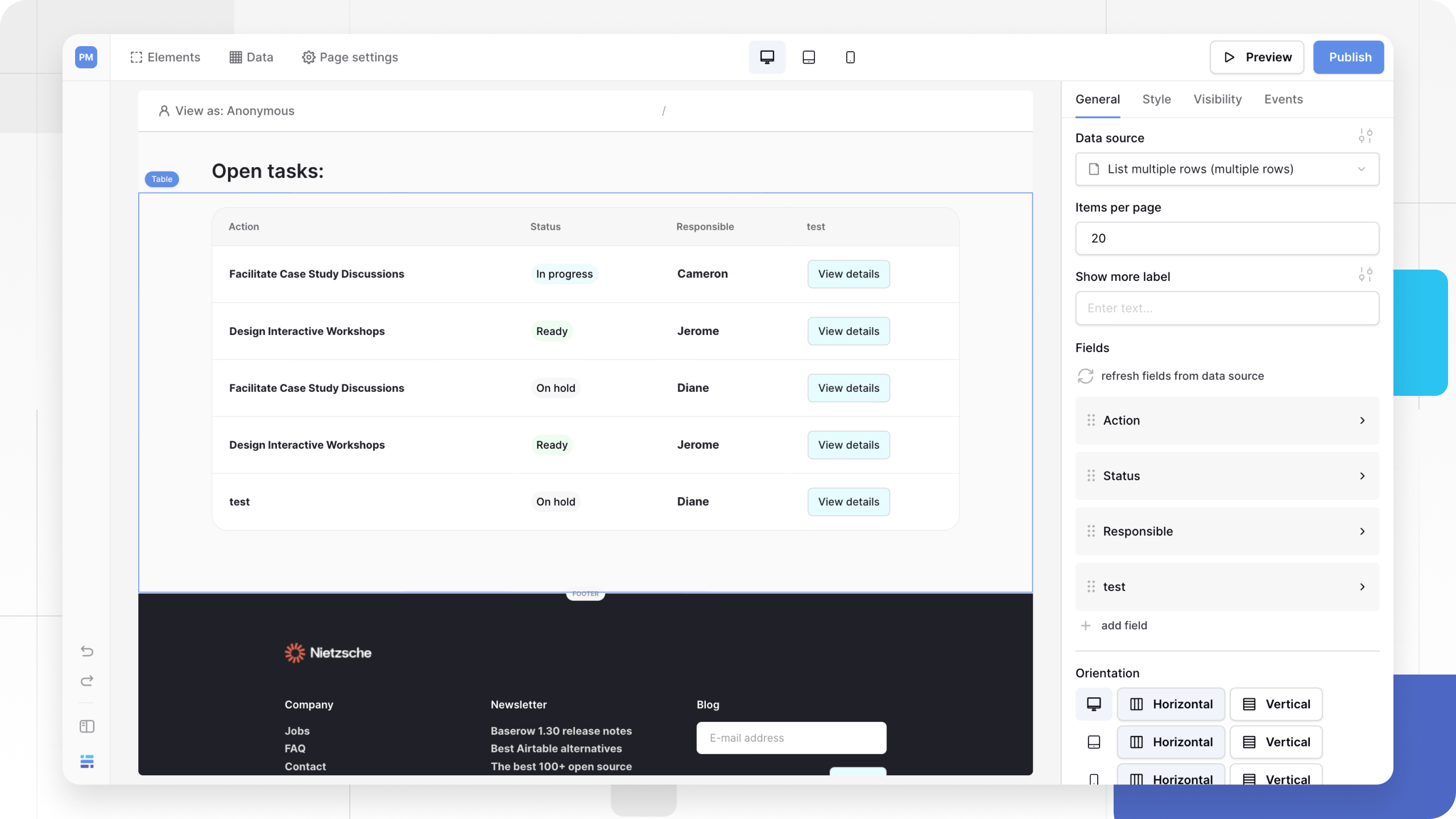
The Table element is the core component for displaying collections of data. It connects to a “List Rows” data source and renders the results as a grid. You can define exactly which columns to show, map them to dynamic data, and add buttons to drill down into record details.
This page covers how to display a list of database records in a structured, customizable grid.
Overview
- Data Source: Requires a Data Source set to “List multiple rows”.
- Fields: You manually define the columns (fields) for the table. You can map text, tags, booleans, and links.
- Interactivity: Supports pagination (“Show More”), filtering, sorting, and searching for end-users.
- Navigation: You can add Link Fields to route users to a “Details Page” for a specific row.
- Styling: Visuals like borders, header colors, and fonts are managed via Theme Overrides.
Add a table
- Open the Elements panel (click the
+icon). - Select Table.
- Drag and drop the element onto your canvas.
Configuration
Click the table element to open the General properties tab.
1. Data Source
Select the source of your data.
- Requirement: The Data Source must use the List multiple rows service type. If you don’t see your source listed, check that it is configured correctly in the Data tab.
- Items per page: Define how many rows appear initially (max 100). A “Show More” button will automatically appear if there are more records to load.
2. Table Fields (Columns)
Unlike a database view, the Table element starts empty. You must add fields to define what columns appear.
To add a column:
- Click + Add field.
- Name: Enter the column header text (e.g., “Customer Name”).
- Type: Select the input type (Text, Link, Boolean, or Tags).
- Value: Bind this to your data. Click the Connect Data icon and select the corresponding field from your Data Source (e.g.,
Current Row > Name).

Field Types:
- Text: Displays plain text or dynamic strings.
- Link: Creates a button or hyperlink. Essential for navigation.
- Boolean: Displays a True/False value (often rendered as a checkmark or status).
- Tags: Displays colored badges/labels.
- Button
- Image
- Rating
3. Orientation
Control how the table adapts to different screens.
- Horizontal: Standard table layout. Fields appear in a row left-to-right.
- Vertical: Stacked layout. Fields appear on top of each other for each record (card style). Best for mobile views.

Master-Detail workflow: Linking to a details page
A common pattern is to show a list of items (Table), and let the user click one to see more info (Details Page).
Step 1: Prepare the Destination Page
Ensure you have a separate page set up with a Path Parameter (e.g., /project/:id) to accept the Record ID.
Step 2: Add a Link Field
- In your Table element configuration, add a new field.
- Set Type to Link.
- Set Link Text (e.g., “View Details”).
- Set Navigate to to Page.
- Select your destination page.
- Map the Parameter: A field will appear for your page parameter (e.g.,
:id). Click the Connect Data icon and selectCurrent Row > Row ID.
Now, when a user clicks “View Details” on row #5, they will be sent to /project/5.

Styling and Theme Overrides
By default, the table inherits the basic table styles from your Global Theme. To customize the look (borders, header colors, fonts), use Theme Overrides.
- In the General tab, click the Style/Settings icon (slider icon) at the top of the configuration panel.
- This opens the Table Styling menu with two tabs:
Tab 1: Table Styling
Customize the structural lines and colors.
- Borders: Toggle borders for the outer table, headers, or cells. Set width and color.
- Header: Custom background color and text alignment for the top row.
- Cells: Padding and alignment for the data rows.
- Separators: Style the lines between rows.
- Show More Button: Customize the color and style of the pagination button.
Tab 2: Typography
Customize the fonts used inside the grid.
- Body Font: Set the font family, weight, and size for the data text.
- Colors: Define text colors for different states.
User interactions
You can allow external users to find data within your table. In the element properties panel, look for the User Actions section.
- Filter: Enable specific fields to be filterable by the user.
- Sort: Allow users to click headers to reorder rows.
- Search: Enable a search bar to query specific text fields.

Frequently asked questions (FAQ)
Can I change the order of columns?
Yes. In the Fields configuration list, grab the handle (six dots) on the left of any field and drag it up or down to reorder the columns.
Why is my table empty?
Check your Data Source. Ensure it is set to “List multiple rows” and that the source itself is returning data (check the filters on the Data Source). Also, ensure you have added at least one Field and mapped it to a value.
Can I hide the “Show More” button?
The button only appears if there are more records than the Items per page limit. To “hide” it, increase the limit (max 100), though it will still appear if you have >100 rows.
Related content
Still need help? If you’re looking for something else, please feel free to make recommendations or ask us questions; we’re ready to assist you.
- Ask the Baserow community
- Contact support for questions about Baserow or help with your account.