 Docs
DocsMulti-page header and footer
The Multi-page Header and Multi-page Footer are special container elements designed for consistency. Unlike standard elements that exist only on the specific page where you add them, these global elements allow you to design a structure once and broadcast it to every page in your app.
This page covers how to create global navigation bars and footers that update across your entire application.
Overview
The header and footer elements are perfect for common page elements like navigation bars, branding, or footer information.
- Write Once, Update Everywhere: If you fix a typo in your footer, it updates on every page instantly.
- Automatic Positioning: Headers always snap to the very top; Footers always snap to the very bottom.
- Container Logic: These elements act as empty shells. You must place other elements (like Columns, Images, or Menus) inside them to add content.
- Visibility Control: You can choose to show these global elements on all pages, specific pages, or exclude them from certain pages (like a Login screen).
Add a global element
- Open the Elements panel.
- Scroll to the Layout section (or search).
- Select Multi-page header or Multi-page footer.
- The element will automatically snap to the top or bottom of your canvas.
Add content (Populating the container)
By default, a new header or footer is an empty container. To make it useful, you must add content inside it.
- Drag and Drop: Select standard elements (e.g., an Image for your logo, a Menu for navigation links).
- Place Inside: Add them into the header/footer area until you see the drop zone highlight.
- Layout: We highly recommend adding a Columns element inside the header first. This allows you to place your Logo on the left and your Menu on the right.
Styling Note: These containers do not have their own “Theme Overrides.” To style the look (e.g., change the font of the links or the size of the logo), you must configure the properties of the specific elements you placed inside.
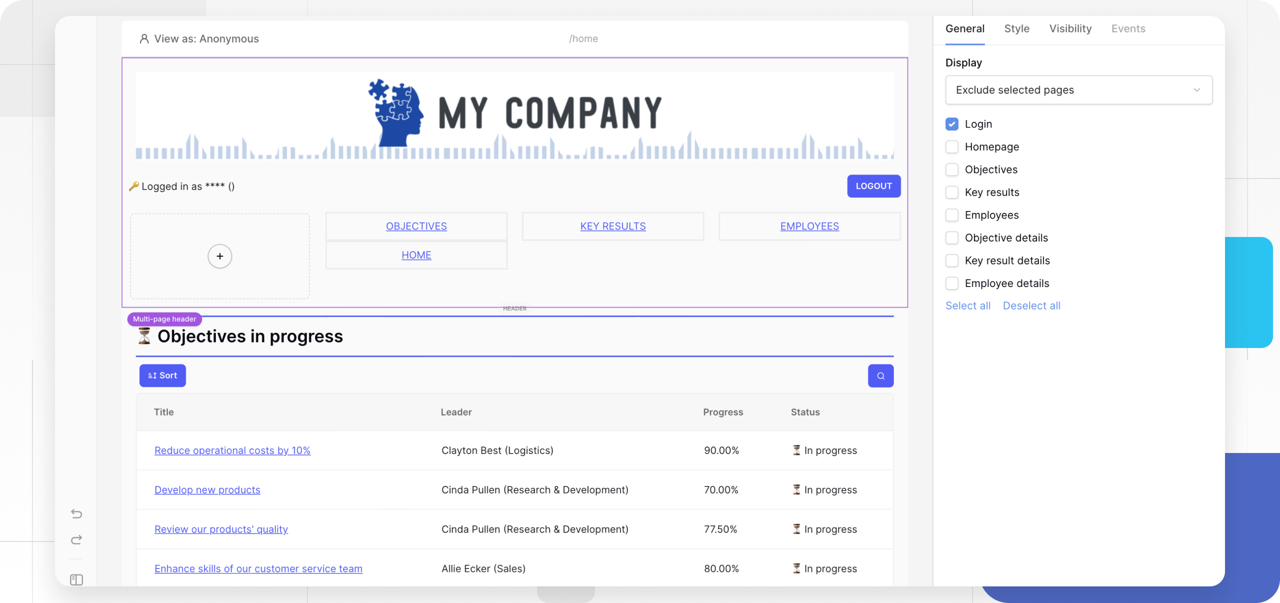
Configure display settings (Visibility)
The most powerful feature of multi-page elements is controlling where they appear. You might want a Header on all pages except your “Sign Up” page.
- Click the Header or Footer element to open the General properties tab.
- Locate the Display section.
- Choose one of the following modes:
| Option | Description | Use Case |
|---|---|---|
| On all pages | The element appears everywhere. | Standard navigation bars. |
| Only on selected pages | You manually check which pages show this element. | A specialized footer for “Help Center” pages only. |
| Exclude selected pages | Appears everywhere except the pages you check. | Hiding the main menu on “Login” or “404 Error” pages. |
Frequently asked questions (FAQ)
Can I have multiple headers?
You can technically add multiple header elements, but they will stack at the top. A better approach for different user roles (e.g., Admin vs. User) is to have one header containing elements with Visibility Roles applied to them.
How do I change the background color?
Since the Multi-page element is a structural container, it usually adopts the page background or a transparent state. To create a colored bar, add a Container or Column element inside the header, set its background color using the Style Tab, and ensure it is set to “Full Width.”
Can I move the header to the middle of the page?
No. Multi-page headers are hard-coded to remain at the top of the viewport, and footers at the bottom, to ensure consistent UX standards.
Related content
Still need help? If you’re looking for something else, please feel free to make recommendations or ask us questions; we’re ready to assist you.
- Ask the Baserow community
- Contact support for questions about Baserow or help with your account.