 Docs
DocsApplication Builder - Choice element
The Choice element (formerly the Dropdown element) is a flexible input tool. It allows you to present a predefined list of options to your users. Depending on your configuration, this can look like a compact dropdown menu, a list of radio buttons for single selection, or a group of checkboxes for multiple selections.
This page covers how to allow users to select one or multiple options via dropdowns, radio buttons, or checkboxes.
Overview
Choice elements are versatile components used for various purposes, including creating navigation menus and selecting options from a predefined list.
- Versatility: Can be configured as a Dropdown, Radio List (Single Select), or Checkbox List (Multi-select).
- Options: You can define static options manually or pull dynamic options from a Data Source.
- Validation: Supports “Required” fields and default values.
- Styling: Visual properties (Colors, Borders, Padding) are managed via Theme Overrides.
The Record Selector element enhances how users link and select related rows from other tables, making it especially useful for handling large datasets. Learn more about how to use the Record Selector element.
Add a choice element
- Open the Elements panel (click the
+icon). - Select Choice.
- Drag and drop the element onto your canvas (typically inside a Form Container).
Configuration
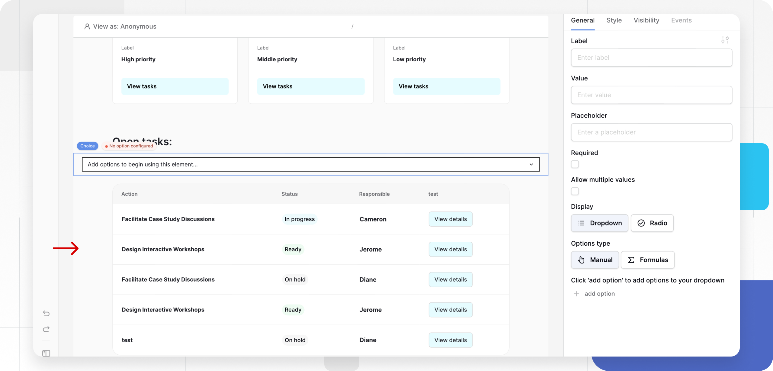
Click the element to open the General properties tab.
1. Content & Logic
- Label: The descriptive text displayed above the field (e.g., “Select Department”).
- Placeholder: Hint text displayed inside a dropdown when empty (e.g., “Choose one…”).
- Value: The option that is selected automatically when the page loads.
2. Defining Options
You must define what users can pick. You have two methods:
Method A: Static Options (Manual) Use this for fixed lists that rarely change (e.g., “Yes/No” or “High/Medium/Low”).
- Click + Add option.
- Name: The text the user sees (e.g., “High Priority”).
- Value: The data saved to the database (e.g.,
high_priority).
Method B: Dynamic Options (Data Source) Use this to populate the list from your database (e.g., a list of Active Employees).
- Click the Data Source dropdown under “Options source”.
- Select a connected Data Source.
- Name Field: Select the column to display to the user (e.g.,
Employee Name). - Value Field: Select the column to save (e.g.,
Employee ID).
3. Selection & Display Behavior
Control how the user interacts with the options.
-
Allow multiple values:
- Off (Single Select): User can pick only one option.
- On (Multi-select): User can pick several options.
-
Display:
- Dropdown: Options are hidden inside a collapsible menu. Best for long lists to save space.
- List (Radio/Checkbox): Options are displayed as an open list on the page.
- If Single Select: Displays as Radio Buttons.
- If Multi-select: Displays as Checkboxes.
4. Validation
- Required: If checked, the user cannot submit the form without making a selection.
Styling and Theme Overrides
By default, the element inherits styles from your Global Theme. To customize a specific element (e.g., to make the dropdown background blue), use Theme Overrides.
- In the General tab, look for the Style/Settings icon (slider icon) next to the Label or Input sections.
- Clicking this opens the specific styling menu.
Styling the Label
- Typography: Font family, weight, size, and color.
- Alignment: Left, Center, or Right.
Styling the Input (Box/List)
- Background: Color of the dropdown box or option background.
- Border: Color, width, and radius.
- Padding: Spacing inside the selection box.
- Typography: Font settings for the option text.
Frequently asked questions (FAQ)
When should I use the Record Selector instead?
The Choice element is best for simple lists or when you want to display Radio/Checkboxes. If you are dealing with very large datasets (thousands of rows) where a user needs to search and link complex records, the Record Selector is often a better choice for performance.
Can I pre-select multiple options?
Yes. In the Default Value field, you can select multiple items if “Allow multiple values” is enabled.
How do I save the selection?
Like other input elements, the Choice element does not save data automatically. It must be placed inside a Form Container or used with a Button action (Create/Update Row) to map the selected Value to a specific table column.
Related content
Still need help? If you’re looking for something else, please feel free to make recommendations or ask us questions; we’re ready to assist you.
- Ask the Baserow community
- Contact support for questions about Baserow or help with your account.