 Docs
DocsGraph element
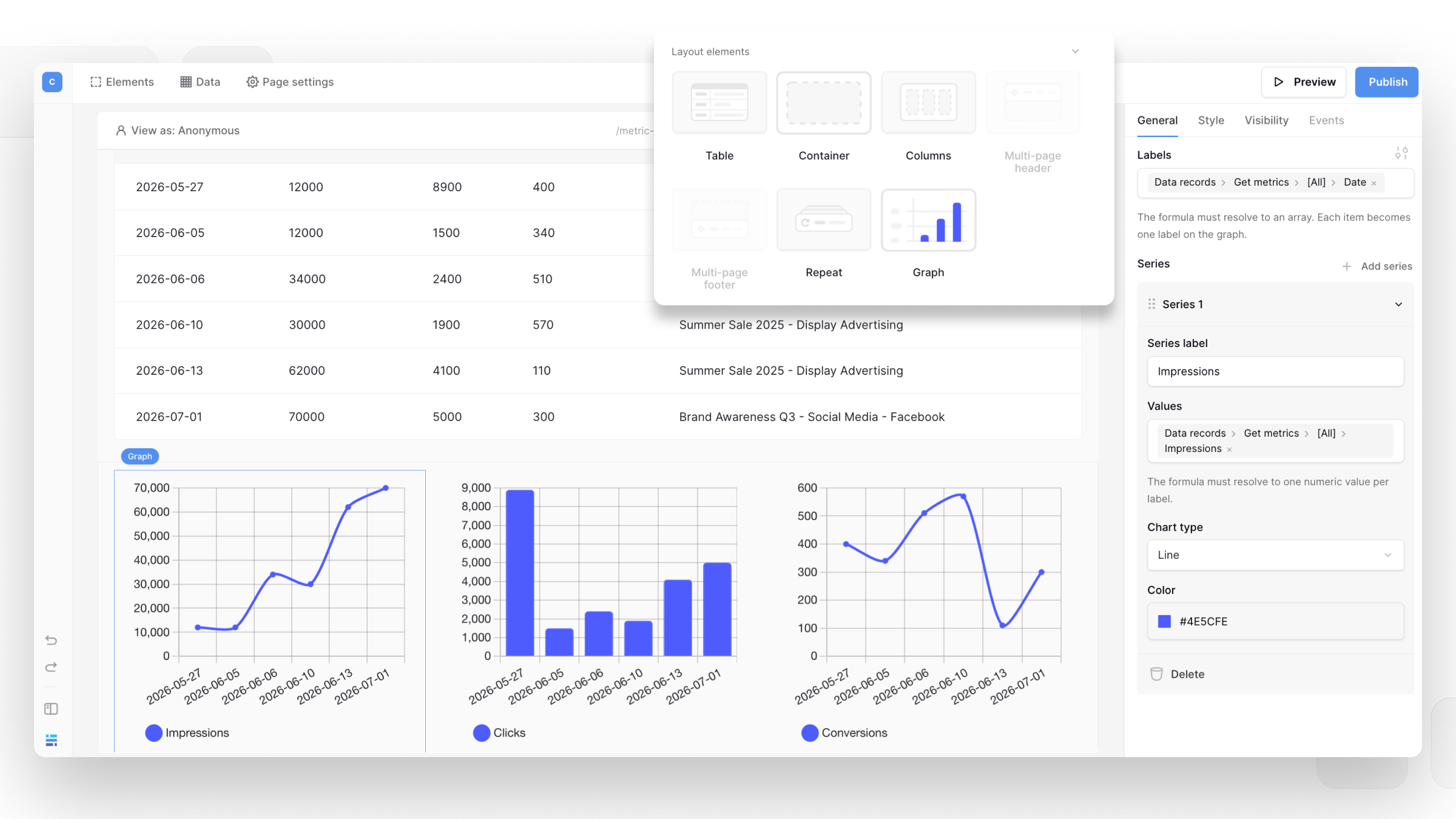
The Baserow Graph element lets you display data as a bar or line chart in your application.
This guide explains how to add a Graph element, configure its labels and data series, and customize how your data is displayed.
This feature is available on the Advanced or Enterprise plan.
Overview
A Graph element is useful for visualizing data and making trends or comparisons easier to understand.
You can:
- Display data as a bar or line chart
- Add multiple data series
- Use formulas to define labels and values
- Customize the color of each series
How to add a Graph element
- In the Application Builder, open the element picker.
- Under Layout elements, select Graph.
Customize the Graph element
You can configure the Graph element from the ‘General’ tab.
- ‘Labels’: Define the labels displayed on the chart. The formula should return an array of labels.
- ‘Series’: Add one or more data series to the chart.
- ‘Series label’: Enter the name of the series.
- ‘Values’: Define the values displayed for each label. The formula should return an array of numeric values.
- ‘Chart type’: Choose between ‘Bar’ and ‘Line’.
- ‘Color’: Choose the color for the series. You can use a theme color or a custom color.
The number of values in each series should match the number of labels.
You can use data from your application in the formulas for ‘Labels’ and ‘Values’, so the graph can update automatically as your data changes.
Example: Monthly spending
You could create a graph showing monthly spending with:
- ‘Labels’: months such as January, February, and March
- ‘Series label’:
Monthly spending - ‘Values’: the corresponding spending amounts
- ‘Chart type’:
Bar
This displays each month’s spending as a bar, making it easy to compare values.
Frequently asked questions
Can I add multiple series to a Graph element?
Yes. Click ‘Add series’ to add another series. Each series can have its own label, values, chart type, and color.
Which chart types are available?
You can display a series as a bar or line chart.
Can I use formulas in a Graph element?
Yes. The ‘Labels’ and ‘Values’ fields support formulas, allowing you to use data from your application.
Related content
Still need help? If you’re looking for something else, please feel free to make recommendations or ask us questions; we’re ready to assist you.
-
Contact support for questions about Baserow or help with your account.